Chapter 9 Intro to Data Analysis
Now, we will embark on a comprehensive journey through the data analysis process, focusing on the essential steps of data wrangling and advanced analytical techniques. The chapter is designed to equip you with the necessary skills to use R effectively for organizing and transforming your data, a crucial foundation for any data analysis project. We will delve into the core workflow that is applicable to every data analysis task, regardless of its complexity or duration. This workflow is not just a one-time learning curve but a set of skills you will repeatedly use across various projects.
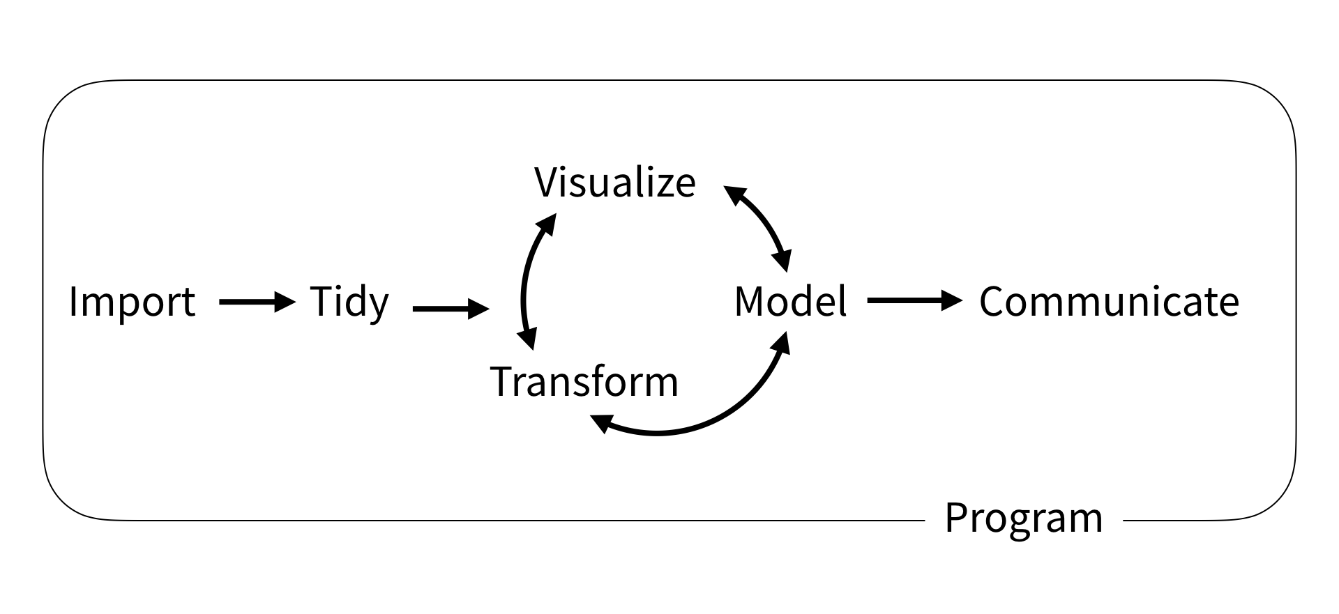
The explicit workflow we’ll be teaching was originally described by Wickham and Grolemund, and consists of six key steps:

- Import is the first step and consist of getting your data into R. Seems obvious, but doing it correctly will save you time and headaches down the line.
- Tidy refers to organizing your data in a tidy manner where each variable is a column, and each observation a row. - Transform is anything you do to your data including any mathematical operations or narrowing in on a set of observations. It’s often the first stage of the cycle as you’ll need to transform your data in some manner to obtain a desired plot.
- Visualize is any of the plots/graphics you’ll generate with R. Take advantage of R and plot often, it’s the easiest way to spot an error.
- Model is an extension of mathematical operations to help understand your data. The linear regressions needed for a calibration curve are an example of a model.
- Communicate is the final step and is where you share the knowledge you’ve squeezed out of the information in the original data.
Import, Tidy, and Transformation go hand-in-hand in a process called wrangling, which encompasses all of the steps needed to get your data ready for analysis. It’s often the most tedious and frustrating, hence “wrangling” (it’s a fight…), but once done make the subsequent cycle of understanding your data via transformation, visualizations, and modelling much easier and more predictable.
9.1 Example Data
Throughout this chapter and the next chapter we’ll be making use of a couple of example datasets. These datasets are all available in the data subfolder of the R4EnvChem Project Template. If you haven’t already, read Importing a project for instructions on downloading the repository and data.
9.2 Sneak Peek at Data Analysis
As a preview, we’ll explore how data analysis can provide insights into real-world phenomena. We’ll use the storm dataset from the tidyverse suite in R to investigate the patterns and relationships of storms over the years.
9.2.1 Setting Up
Let’s begin by loading our dataset and essential packages.
Let’s see how the data looks:
9.2.2 Tidying Our Data
Now that you saw how the data looks, before delving into deeper analysis, it’s important to have a general sense of our data.
To narrow our focus, let’s consider the storm name, year, month, day, lat, long, and wind speed.
# 1. Selecting relevant variables

selected_storms <- storms %>%
  select(name, year, month, day, lat, long, wind)

DT::datatable(selected_storms)
Next, instead of having separate columns for year, month, and day, it might be more useful to have a single date column.
# 2. Creating a unified date column

storms_with_date <- selected_storms %>%
  unite("date", year, month, day, sep = "-") %>%
  mutate(date = as.Date(date, format = "%Y-%m-%d"))

DT::datatable(storms_with_date)
Column names should be self-explanatory. Let’s rename wind to wind_speed_knots.
# 3. Renaming columns for clarity

tidied_storms <- storms_with_date %>%
  rename(wind_speed_knots = wind)
Now that our data is tidied up, let’s see if we can do more in-depth analysis.
9.2.3 Investigating Storm Patterns
9.2.4 Visualization: Geographical Distribution
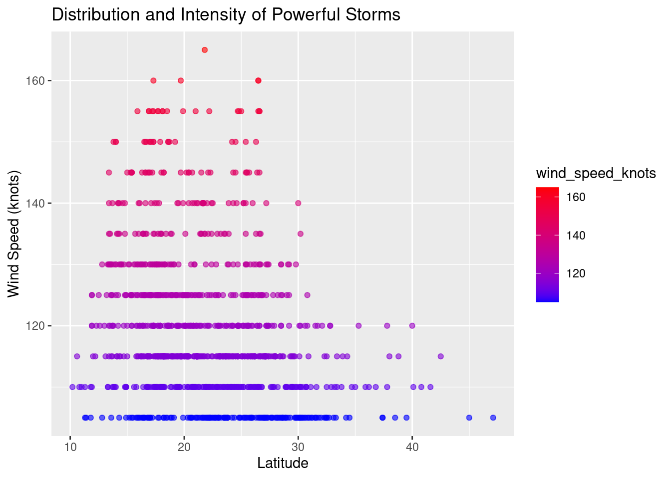
One of the key aspects of understanding storms is analyzing where they occur. Using our powerful storms data, let’s plot a scatterplot of latitude versus wind_speed_knots to visualize their geographical distribution and intensity.
ggplot(data = powerful_storms, aes(x = lat, y = wind_speed_knots)) +
  geom_point(aes(color = wind_speed_knots), alpha = 0.6) +
  ggtitle("Distribution and Intensity of Powerful Storms") +
  xlab("Latitude") +
  ylab("Wind Speed (knots)") +
  scale_color_gradient(low = "blue", high = "red")
Through this brief exploration, we’ve seen how data analysis can provide insights into storm patterns. With more advanced techniques, which we’ll explore in the subsequent chapters, we can delve even deeper, helping inform decisions, ensuring preparedness, and advancing our understanding of meteorological phenomena.
9.3 Further Reading
In case it hasn’t been apparent enough, this entire endeavour was inspired by the R for Data Science reference book by Hadley Wickham and Garrett Grolemund. Every step described above is explored in more detail in their book, which can be read freely online at https://r4ds.had.co.nz/. We strongly encourage you to read through the book to supplement your R data analysis skills.