Chapter 13 Ggplot Basic Visualizations
ggplot2 is loaded by default with the tidyverse suite of packages. Let’s revisit our spectroscopy data we encountered in Tidying Your Data:
## Rows: 28628 Columns: 3
## ── Column specification ────────────────────────────────────────────────────────
## Delimiter: ","
## chr (1): sample
## dbl (2): wavenumber, absorbance
##
## ℹ Use `spec()` to retrieve the full column specification for this data.
## ℹ Specify the column types or set `show_col_types = FALSE` to quiet this message.13.1 Building plots ups
The gg in ggplot2 stands for the grammar of graphics, (H. Wickham 2009) and it’s a way to break down graphics (plots) into small pieces that can be discussed (hence grammar). We’ll take a look at this grammar via geoms (what kind of plot), aes (aesthetic choices), etc. For now, understand that this means we need to build up graphics/plots piece-by-piece and layer-by-layer. This extends beyond code to how we code. Plot often, and discard the useless ones. Take the time to pretty up your plot after you’re satisfied with the underlying data.
13.2 Basic plotting
ggplot2 uses geoms to specify what type of plot to create. Different plots are used to tell different stories and have different strengths and weakness. We’ll explore these more in Visualizations for Env Chem, but for now we’ll focus on geom_point(), which simply plots data as points on the 2-D plane. In other words, a scatter plot.
Let’s plot our tidied atr_data data:
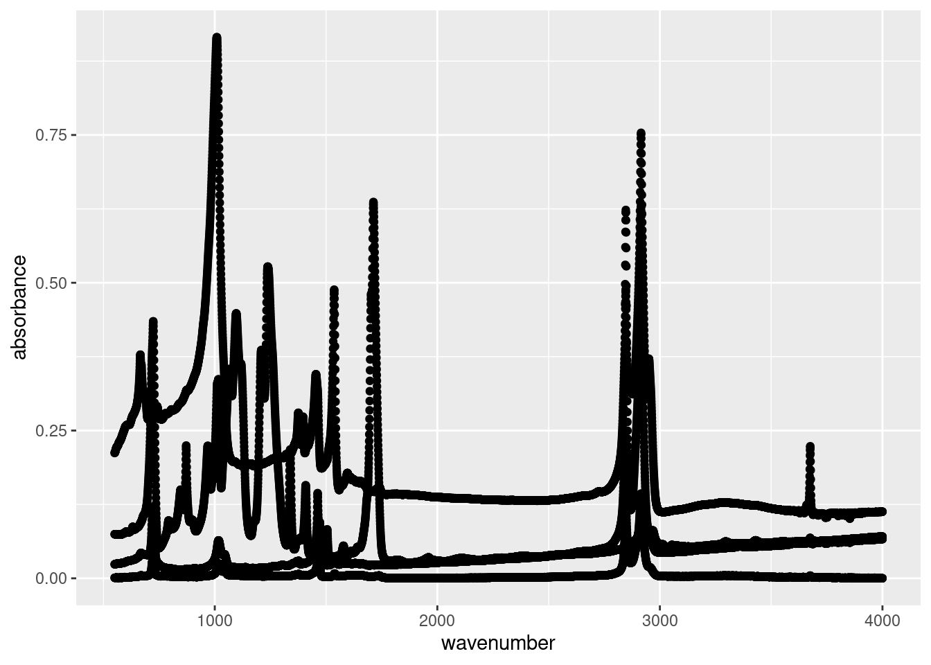
Let’s ignore the plot for now and look at our code below:
ggplot()creates a ggplot object that contains specifications for the plot:
- We want to plot data from our
atr_datadataset (data = atr_data). - We specified our aesthetic mappings via
aes(), which communicates how we want the plot to look. In this case, we’ve specified which values fromatr_dataare the x-axis values (x = wavenumber) and y-axis values (y = absorbance).
- We then add the
geom_point()layer to create a scatter plot of (x,y) points.
Now let’s look at our result. What we see is a point for every recorded absorbance measurements from our ATR analysis. We can clearly see the spectra of the different plastics in our data, however they’re all coloured the same. This is because we’ve only specified the x and y values. As far as ggplot() is concerned, these are the only values that matter, but we know different.
Fortunately you can pass multiple variables to different aes() options to enhance our plot. For instance, we can pass the sample variable, which specifies which sample a spectrum originates from, to the colour option:
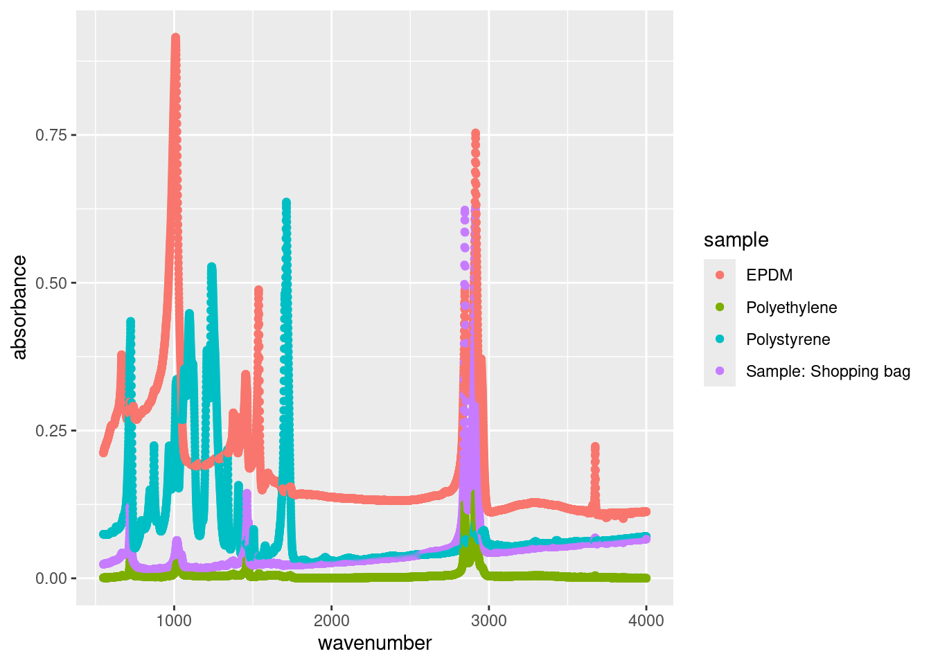
Now we have a legend which clearly specifies which points are associated with each sample. But now the points are too large, potentially masking certain peaks. We can adjust the size of each point as follows:
ggplot(data = atr_data,
aes(x = wavenumber,
y = absorbance,
colour = sample)) +
geom_point(size = 0.5)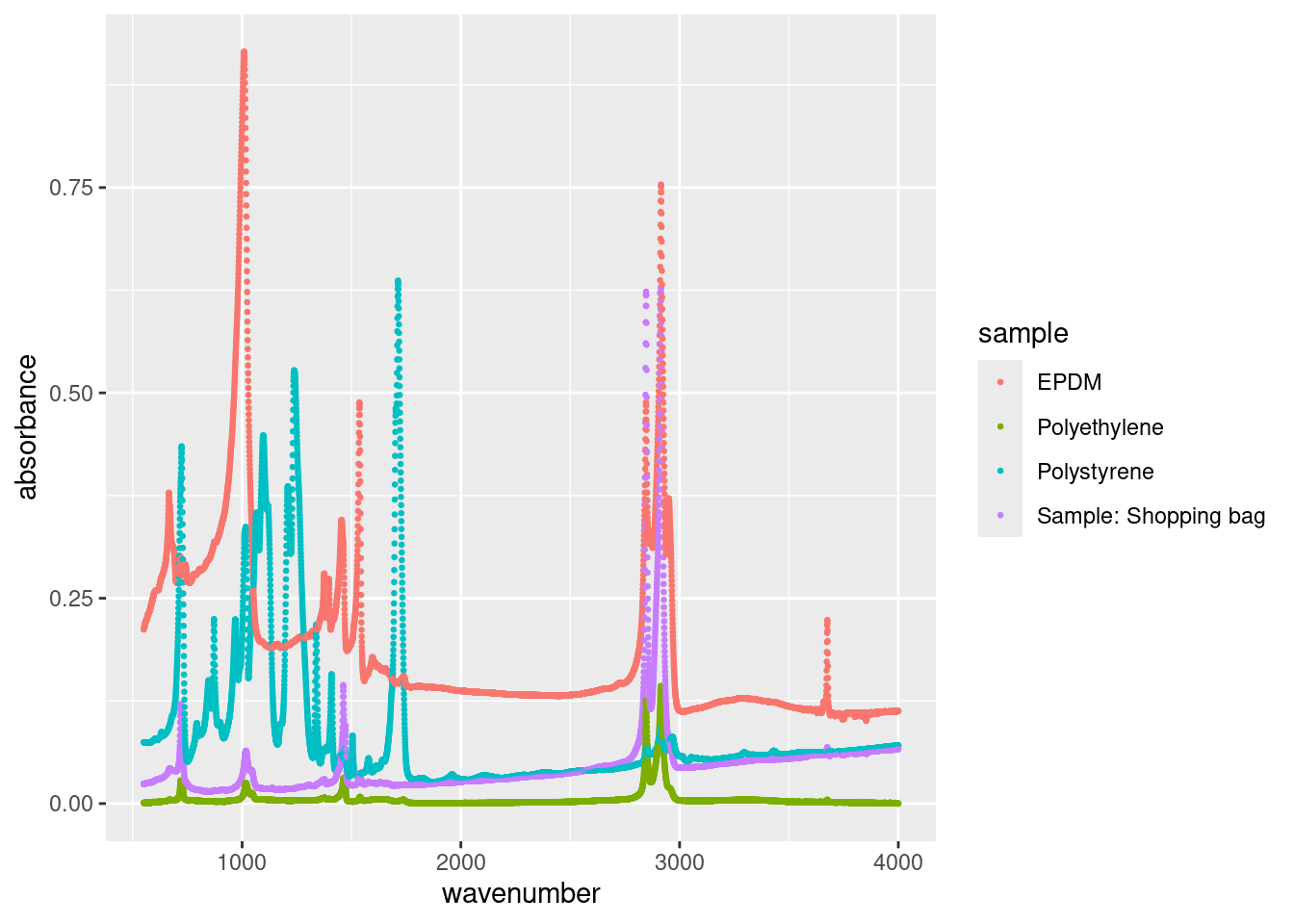
We specified size = 0.5 in the geom_point() call because it’s a constant. We can map size to any continuous variable, such as the absorbance:
ggplot(data = atr_data,
aes(x = wavenumber,
y = absorbance,
colour = sample,
size = absorbance)) +
geom_point()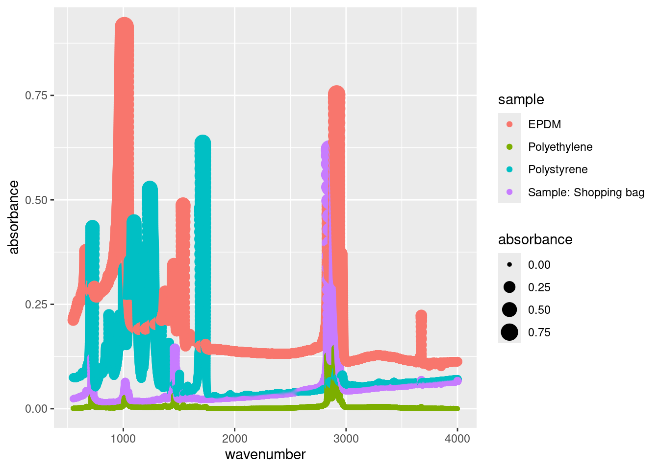
Sometimes this makes sense (i.e. a bubble chart) but for our example, having the size of the points increase as the absorbance increases doesn’t provide any new information (it actually clutters our plot).
13.3 Changing plot labels
By default ggplot uses the header of the columns you passed for the x and y aes() options. Because headers are written for code they’re often poor label titles for plots. We can specify new labels and plot titles as follows:
ggplot(data = atr_data,
       aes(x = wavenumber,
           y = absorbance,
           colour = sample)) +
geom_point() +
labs(title = "ATR Spetra",
subtitle = "Courtesy of CHM317 student data",
x = "Wavenumber, cm^-1",
y = "Absorbance (arbitrary units)",
caption = "hi mom",
colour = "Plastic")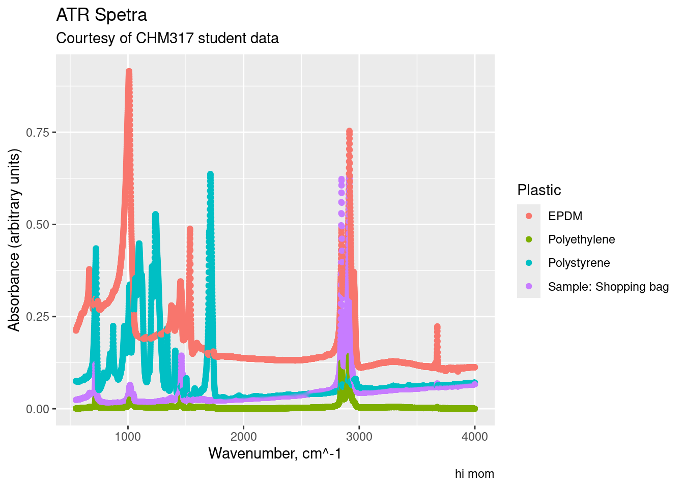
Note how we changed the title of the legend with colour = "Plastics". This is because the legend is generated from our colour aesthetic (aes(..., colour = sample)). If our legend was based off of the size aesthetic, we would use size = "New Title" to change the title for the size legend.
13.4 Small Multiples
Sometimes your plots become overwhelming, a phenomena called overplotting, which prevent your from comparing graphs or charts. A popular solution is small multiples, a series of similar plots using the same scale and axes. This is readily accomplished in R using facet_grid() (which creates a 2-D grid ) or facet_wrap() (a single 1d ribbon wrapped into 2D space). You simply specify which variable you want to differentiate your plots, for us it’s sample:

Note the use of the tilde (~) in facet_wrap(~sample); in this situation, it’s shorthand telling facet_wrap() to make small multiples off of the sample variable.
13.5 Plotting subsets of data
Often you won’t want to plot everything in your dataset. Rather, you’ll want to plot a specific chemical, city, location, etc. To that end you want to plot a subset of your data. There are a couple of ways to handle this.
You can subset your data on the fly using subset(). This way allows you to specify based off of Logical operators as such:
ggplot(data = subset(atr_data, sample == "EPDM"),
       aes(x = wavenumber,
           y = absorbance)) +
  geom_point()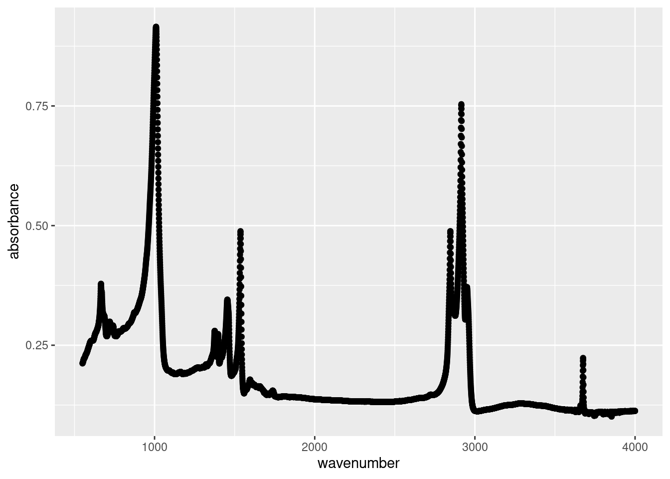
or
ggplot(data = subset(atr_data, wavenumber >= 2500),
       aes(x = wavenumber,
           y = absorbance)) +
  geom_point()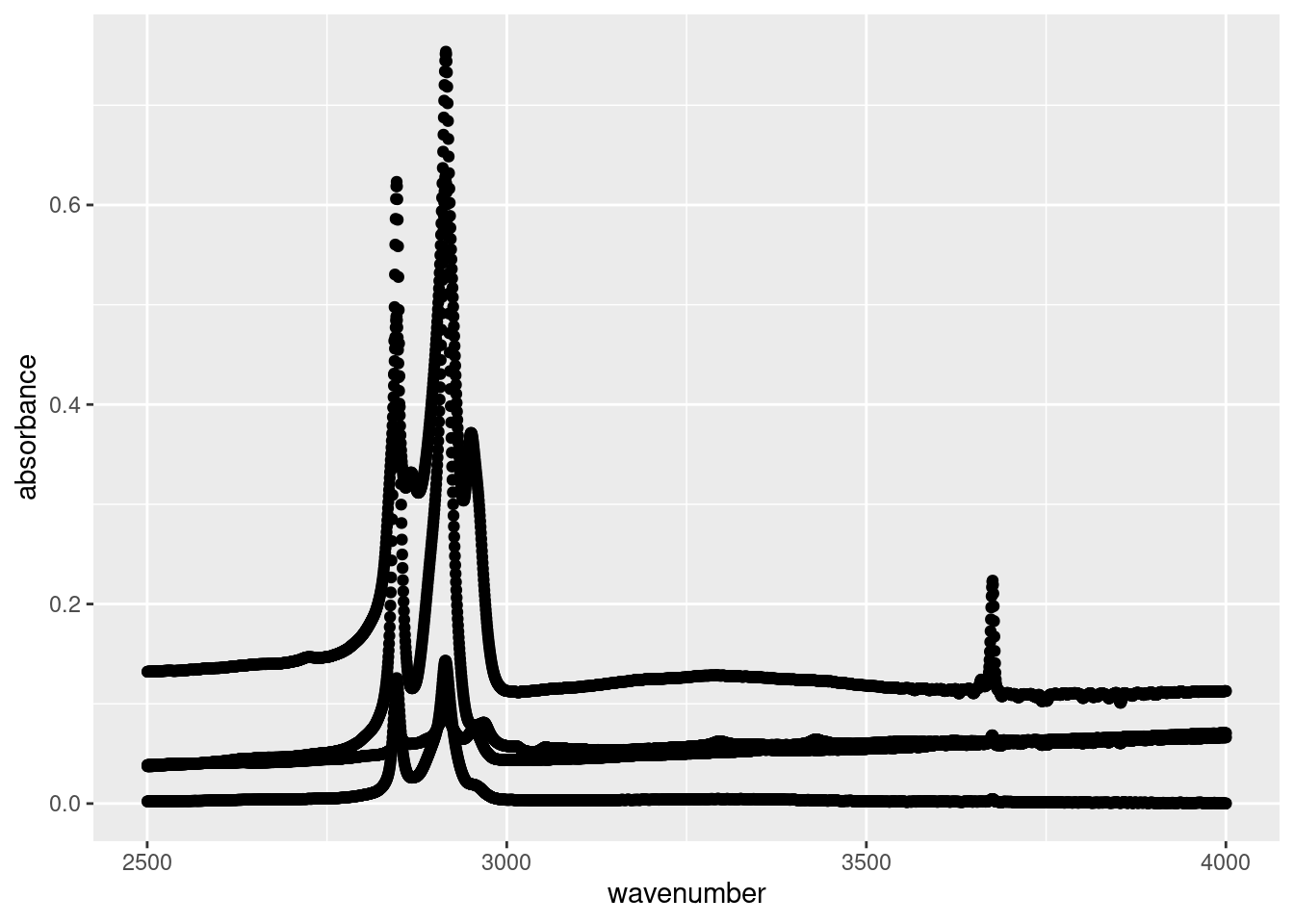
Another approach is to use filter() and pipe to ggplot():
atr_data %>%
  filter((sample != "EPDM" & wavenumber <= 2500) | (sample == "EPDM" & wavenumber >= 3500)) %>%
  ggplot(aes(x = wavenumber, y = absorbance, colour = sample)) +
  geom_point()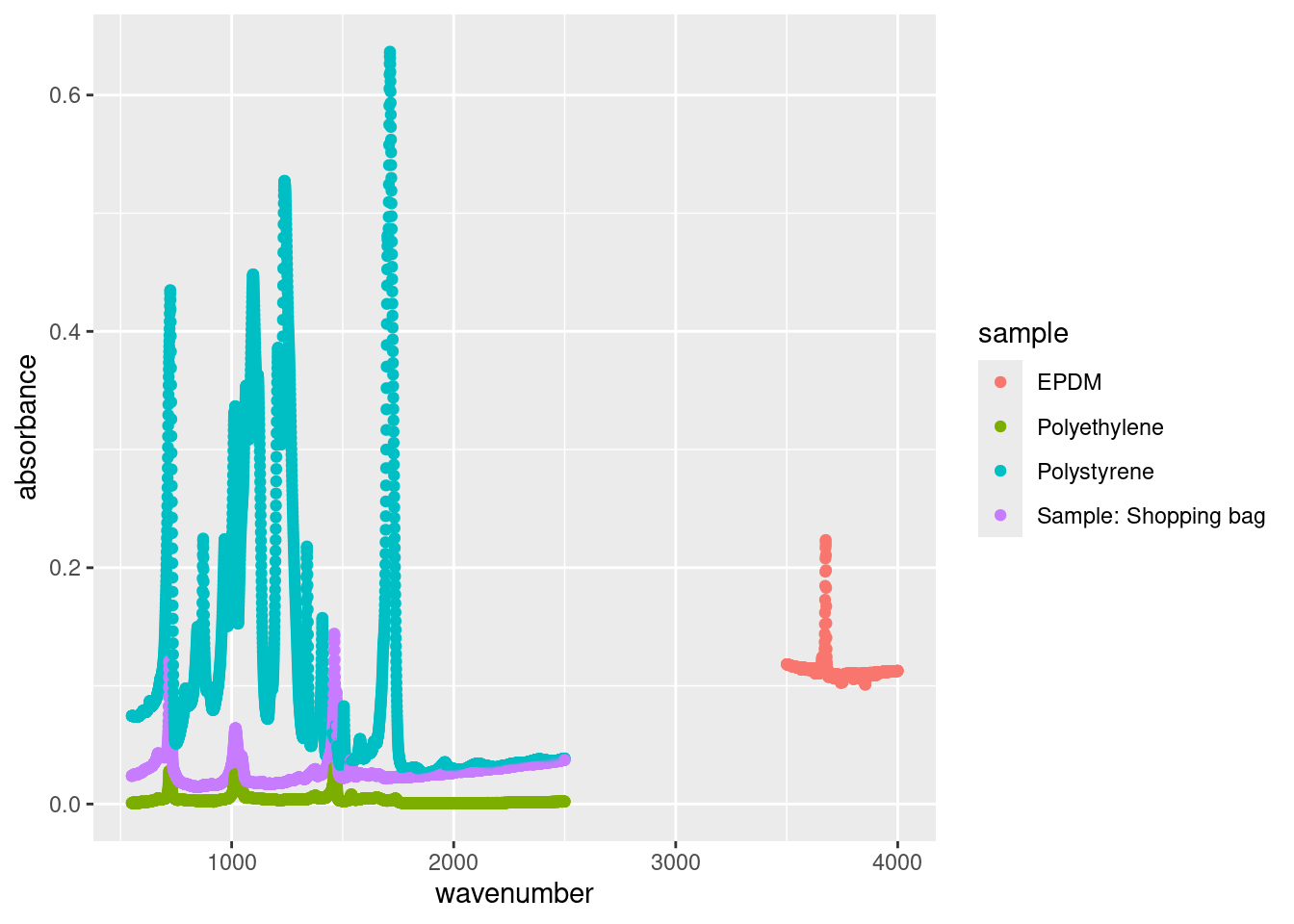
There are pros and cons to either approach. subset() on the fly is best for simple task, like plotting a single city, whereas the piping approach is best for more complex sorting.
13.6 Exercise
There is a set of exercises available for this chapter!
Not sure how to access and work on the exercise Rmd files?
Refer to Running Tests for Your Exercises for step-by-step instructions on accessing the exercises and working within the UofT JupyterHub’s RStudio environment.
Alternatively, if you’d like to simply access the individual files, you can download them directly from this repository.
Always remember to save your progress regularly and consult the textbook’s guidelines for submitting your completed exercises.