Chapter 18 Customizing your plots
Up until now we haven’t paid much attention to the explicit aesthetics of plots beyond what we needed for our exploratory analysis. However, many journals, publications, instructors, etc. will want plots to adhere to certain aesthetic standards. There are scores of options to play with, so we recommend you consult the ggplot2 Cheat Sheet.
18.1 Interactive Plots
Ultimately your visualizations will be printed to a static PDF document, but in the interim having an interactive plot can be helpful for data exploration. The plotly package magically makes most ggplots interactive with a simple command. Here’s an example with our Toronto air quality data:
## Rows: 507 Columns: 8
## ── Column specification ────────────────────────────────────────────────────────
## Delimiter: ","
## chr  (3): city, p, pollutant
## dbl  (4): naps, latitude, longitude, concentration
## dttm (1): date.time
##
## ℹ Use `spec()` to retrieve the full column specification for this data.
## ℹ Specify the column types or set `show_col_types = FALSE` to quiet this message.
torPlot2 <- ggplot(data = torontoAir,
aes(x = date.time,
y = concentration,
colour = pollutant)) +
geom_line()
plotly::ggplotly(torPlot2)This is also super useful when surveying spectroscopy data, although the large number of points in those datasets can take a while to render into interactive plotly plots.
18.2 Plot Themes
Overall themes can be applied to ggplot. The simple and minimalist theme_classic() is satisfactory for most submissions, but you can peruse the available themes in ggplot here or you can explore many more themes in the ggthemes package.
# generating example plot to modify
p <- ggplot(data = torontoAir,
            aes(x = date.time,
                y = concentration,
                colour = pollutant)) +
  geom_point()

# Default theme
default <- p + labs(title = "Default theme")

# Classic theme
classic <- p +
  theme_classic() +
  labs(title = "Classic theme")

# Arranging into grid
gridExtra::grid.arrange(default, classic, ncol = 2)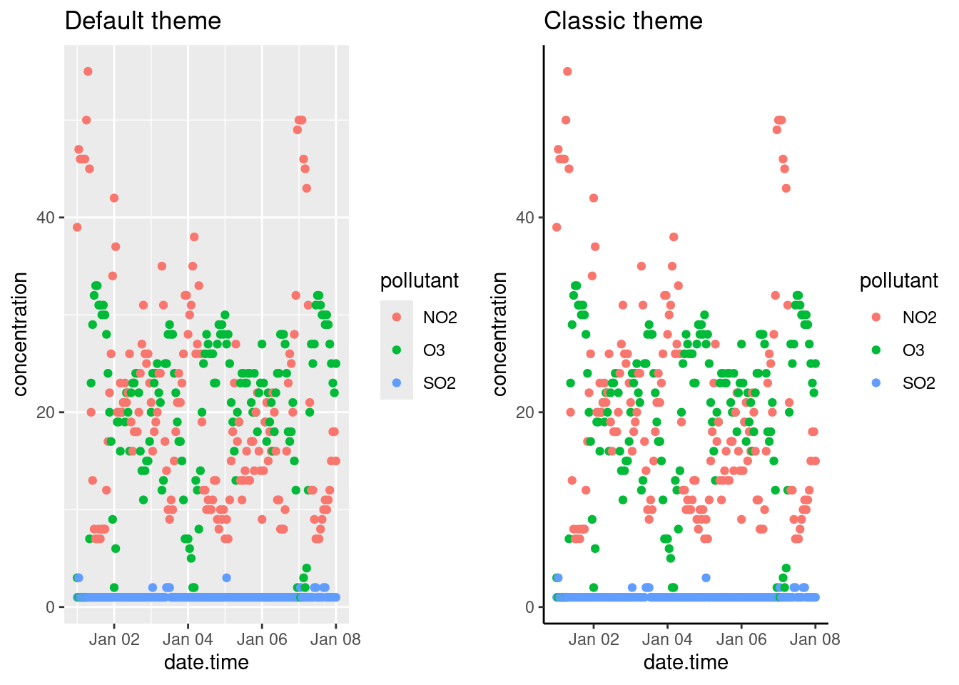
18.3 Legends
You can specify the position of the legend under the theme() option as such:
bottom <- p + theme(legend.position = "bottom")

inside <- p + theme(legend.position = "inside",
                    legend.position.inside = c(.5, .5))

gridExtra::grid.arrange(bottom, inside, ncol = 2)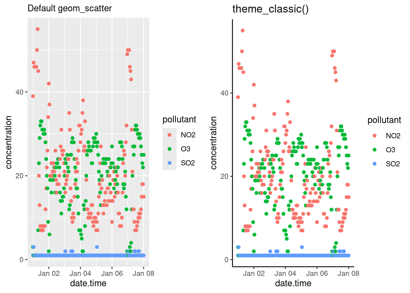
Other legend positions include: "left", "right", "bottom", "top" and "none" (remove legend entirely). Use legend.position.inside with a two-element numeric vector to specify the location. For example, use c(0.95, 0.95) for inside the top-right corner and c(0.05, 0.05) for inside the bottom right corner.
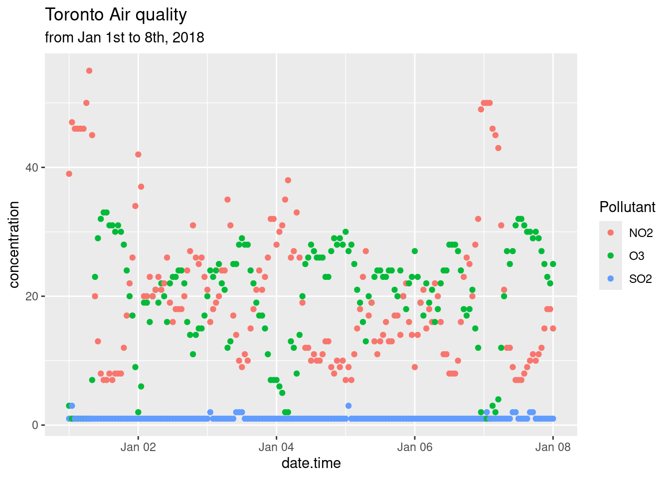
18.4 Modifying labels
The labels generated for the plots are derived from the variable names passed along to the ggplot() function. Consequently, variable names that are easy to code become ugly labels on the plot. You can modify labels using the labs() function. How to use the labs() function was also discussed in the Bar Charts section of the Common Types of Graphs chapter. Note that in this example we changed the legend’s title by specifying what aes() option we used to create the legend; in the example below it’s colour.
p + labs(title = "Toronto Air quality",
         subtitle = "from Jan 1st to 8th, 2018",
         x = "Date",
         y = "Concentration (ppb)",
         colour = "Pollutant")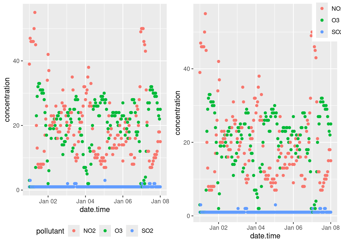
18.5 Modifying Axis
We’ve already talked about labeling axis titles in Modifying labels, and adding marginal plots in Scatter plots. So we’ll just briefly touch upon some simple axis modifications.
18.5.1 Transforming axis
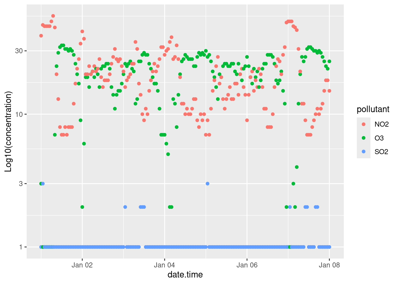
Transformations are largely related to continuous data, and are done using scale_y_continuous() or scale_x_continuous() functions. For example to scale the y-axis of our plot we’d do the following:
Other useful transformations include “log2” for base-2 logs, “date” for dates, and “hms” for time. The latter two are useful if R hasn’t correctly interpreted your dataset. The data type for the data.time column of our dataset was correctly interpreted during our initial importation using read_csv(). Hooray for doing it right the first time.
18.5.2 Axis limits
The limits of plots created with ggplot() are automatically assigned, but you can override these using the lims() function. For example we can specify the limits of our example plot to show from 0 to 100 ppb:
18.5.3 Axis ticks/labels
Sometimes when you are plotting, the length of the axis labels is unreadable. This is often the case with categorical data, such as the names of cities like we’ve encountered earlier. We addressed this earlier in Bar charts by rotating the plot 90\(^\circ\) with the coord_flip() function. This is often the best solution as it’s how we read English. Another solution is to rotate the axis labels themselves:
basePlot <- ggplot(data = filter(sumAtl, p == "NL"),
                   aes(x = city,
                       y = mean)) +
  geom_col()

default <- basePlot +
  labs(title = "default plot")

flip <- basePlot +
  coord_flip() +
  labs(title = "coord_flip()")

rotated <- basePlot +
  theme(axis.text.x = element_text(angle = 45)) +
  labs(title = "element_text(angle = 45)")

rotatedHJust <- basePlot +
  theme(axis.text.x = element_text(angle = 45, hjust = 1)) +
  labs(title = "element_text(angle = 45, hjust = 1)")


gridExtra::grid.arrange(default, flip, rotated, rotatedHJust, ncol = 2, nrow = 2)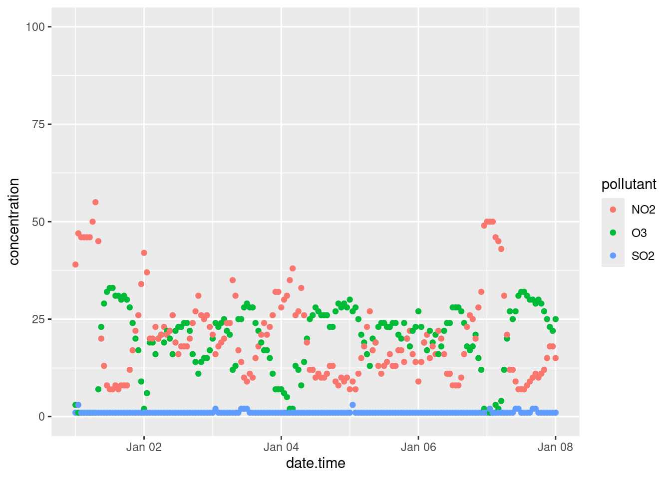
18.6 Arranging plots
We talked about how facets can be used to generate multiple plots from a dataset (small multiples), but sometimes you want to combine two or more different plots together. There are a couple of ways, but we’ve been using grid.arrange() from the gridExtra package (as demonstrated above). You can read up on gridExtra here. There is also the ggarrange function from the ggpubr package which, amongst other things, can easily create shared legends between plots.
colchart <- ggplot(data = sumAtl,
                   aes(x = fct_reorder(city, mean),
                       y = mean,
                       fill = p)) +
  geom_bar(stat = "identity") +
  geom_errorbar(aes(ymin = mean - sd,
                    ymax = mean + sd)) +
  coord_flip()

boxplot <- ggplot(data = atlNO2,
                  aes(x = city,
                      y = conc,
                      fill = p)) +
  geom_boxplot() +
  coord_flip()

boxplot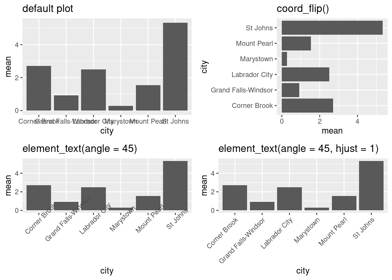
ggpubr::ggarrange(colchart,
                  boxplot,
                  ncol = 2,
                  nrow = 1,
                  labels = c("A", "B"),
                  common.legend = TRUE,
                  legend = "bottom")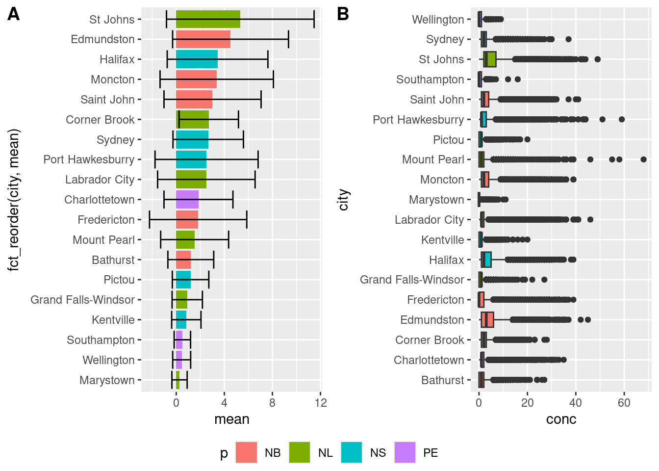
18.7 Exercise
There is a set of exercises available for this chapter!
Not sure how to access and work on the exercise Rmd files?
Refer to Running Tests for Your Exercises for step-by-step instructions on accessing the exercises and working within the UofT JupyterHub’s RStudio environment.
Alternatively, if you’d like to simply access the individual files, you can download them directly from this repository.
Always remember to save your progress regularly and consult the textbook’s guidelines for submitting your completed exercises.